

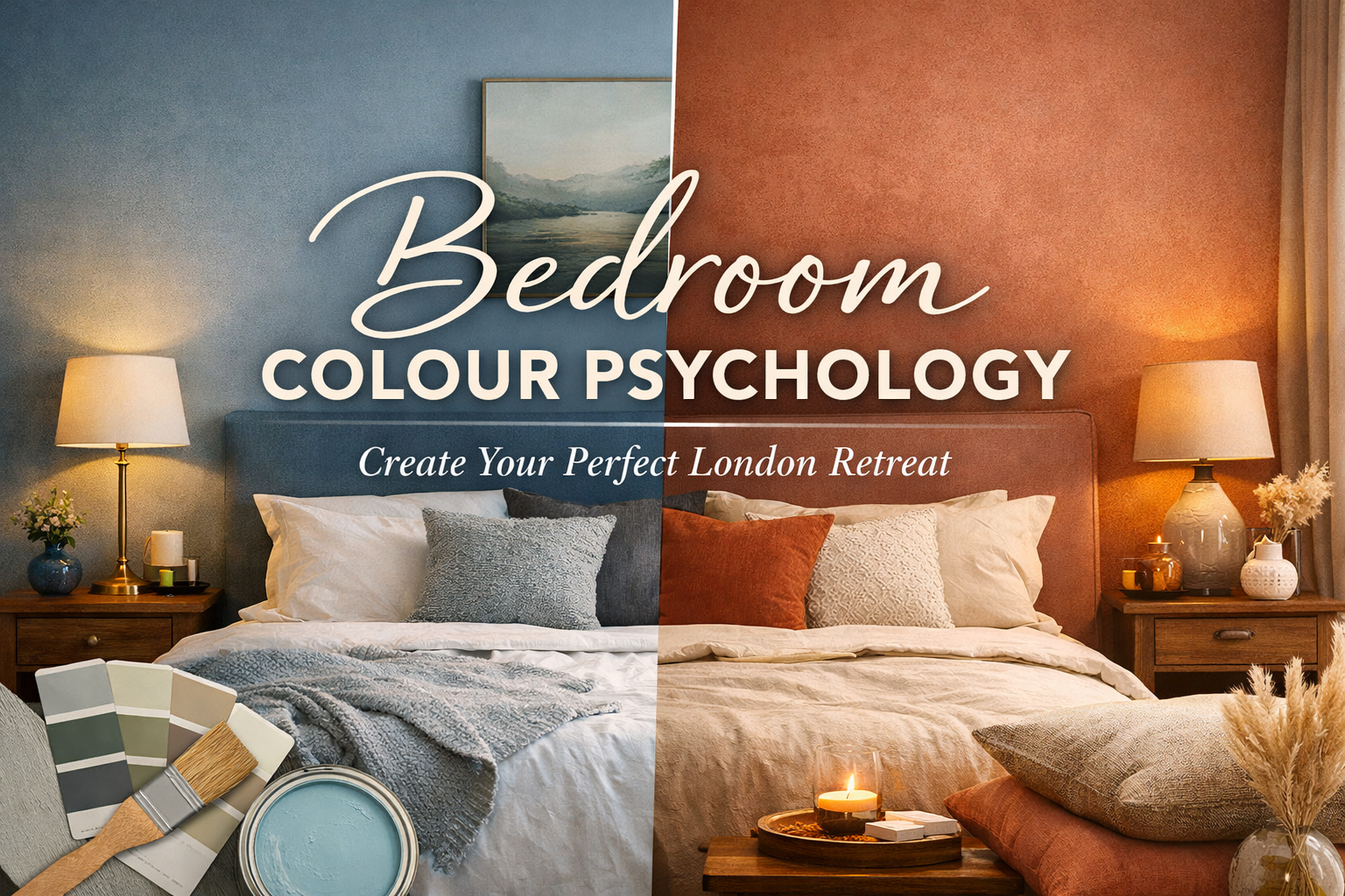
Bedroom Colour Psychology
Bedroom Colour Psychology Guide

A relaxed, designer-led guide for London homeowners who want a bedroom that feels better to live in — and easier to sell later.
If you’ve ever painted a bedroom “a calming colour”… and then wondered why it still feels a bit off, you’re not imagining it. In London homes especially, the same paint can look cosy at 9pm and slightly grim at 11am — because daylight direction, window size, and lighting temperature do a lot of the heavy lifting.
What I’m going to do here is help you pick bedroom colours the way a designer actually does: not “blue = calm”, but colour + light + finish + placement, with a little psychology and a lot of practicality.
How bedroom colour psychology really works
Colour psychology isn’t magic — it’s more like a mood dial. The key levers are:
- Hue (blue vs green vs red)
- Lightness (how close it is to white or black)
- Saturation (how intense or muted it is)
A big, long-running review of colour–emotion research suggests people do show systematic links between colour categories and emotional dimensions like arousal and valence — but it’s not one-to-one, and it’s heavily influenced by lightness/saturation (i.e., a dusty blue behaves differently to a bright blue). (PubMed)
Designer translation: muted colours calm more reliably than loud colours, and dark colours cocoon more than pale colours — regardless of whether they’re “warm” or “cool”.
Before you choose a colour: read your room like a London designer
1) Which way does it face?
- North-facing bedrooms (common in terraces and conversions): daylight is cooler and flatter. Paint can look more grey/blue than you expected.
Best approach: warm neutrals, softened greens, clay/blush tones, or a blue with a warm/grey undertone. - South-facing bedrooms: warmer and brighter light. You can pull off cooler shades or deeper colours without it feeling cold.
Best approach: smoky blues, deeper greens, “hotel” neutrals, even moody charcoals (with warm lighting).
2) What’s the window situation?
Small window? Heavy wardrobe run? Lots of shadow? In that case, avoid very “pure” or icy colours. Go slightly warmer or more muted so the room doesn’t feel bleak.
3) What do you want the room to do?
Pick one primary goal:
- Sleep-first calm
- Cosy cocoon
- Fresh + airy
- Resale-friendly neutral
- Bold personality (with controlled risk)
The best bedroom colours by mood (and how to use them)
Blues: calmer mind, less visual noise

Blue is often the go-to for calm — and broadly, cooler hues tend to feel lower-arousal than hot reds/oranges. There’s also research showing environmental colours can influence arousal/attention measures (context-dependent, but directionally consistent). (PubMed)
London-proof advice:
- Choose greyed, smoky, or inky blues rather than bright “primary” blues.
- If the room is north-facing, pair blue walls with warm white trim and warmer lamps so it doesn’t go chilly.
Where it works best:
- Whole room for a serene feel
- Or a headboard wall if you’re nervous
Greens: restoration, balance, “exhale” energy

Green tends to read as natural and restorative, which is why it’s brilliant for bedrooms in noisy parts of the city.
Designer trick: pick greens that already look good next to your floor tone (oak, walnut, grey laminate) — that’s what makes it feel “expensive”.
My favourite ways to use green:
- Sage/olive for soft calm and easy resale
- Deep green for a boutique-hotel cocoon (especially with warm bedside lighting)
Warm neutrals: the “looks good in any light” workhorse
Warm whites, creams, greige, taupe — these are your most forgiving colours in UK daylight and the easiest for resale/rent.
Property advice sources repeatedly recommend keeping key areas neutral so buyers can imagine themselves living there (and then adding personality with accessories rather than wall colour). (Rightmove)
Where warm neutrals shine:
- Rental properties
- Small bedrooms
- Homes you may sell in the next few years
Blush, clay, muted terracotta: instant comfort (especially in north-facing rooms)
These tones are underrated in London because they warm up cold light and are flattering in the evening.
How to keep it modern (not “pink bedroom”):
- Go muted (think clay, dusty rose, soft terracotta)
- Pair with off-white ceilings, natural textures, and calm artwork
Greys: still usable, but you must warm them up

Grey can look sleek… or just tired. If you love grey:
- choose a grey with warm undertones (greige family)
- use warm bulbs at night
- add texture (linen curtains, wool throw, upholstered headboard)
Reds and oranges: high energy (use as accents, not four walls)


These tones can feel exciting, but for most people they’re not “sleep-first”. If you want warmth, do it with muted terracotta or keep reds/oranges as accents (art, cushions, rug).
Placement tricks that make colour feel calmer and more “designer”
1) The headboard wall rule (simple, effective)
If you want impact without overwhelm:
- Paint only the wall behind the bed
- Keep the other walls a softer neutral
It creates a visual anchor and makes the room feel intentional.
2) Colour drenching (walls + woodwork in one tone)

This reduces contrast and can make a room feel quieter and more cocooning — especially in mid-to-deeper shades.
3) A tinted ceiling for cosy bedrooms
If you’re doing a deeper palette, a slightly tinted ceiling (not brilliant white) makes the room feel wrapped and soft.
Don’t ignore lighting: it can make your “calming colour” feel harsh
Bedrooms are unique because you experience them mostly in the evening — and light at night affects your body.
Research shows that exposure to room light in the late evening can suppress melatonin and change the body’s “internal night”. (PMC)
More recent work also highlights that warmer lighting settings can reduce estimated melatonin suppression compared with very cool (high Kelvin) settings. (PMC)
Quick lighting checklist (easy wins)
- Put bedside lamps on warm, dimmable bulbs
- Avoid very cool “daylight” bulbs in the bedroom at night
- If you’re colour testing, test in daylight + evening lamp light, because that’s when the bedroom mood matters
Real London client-style examples (anonymised)
These are typical outcomes I see in real projects — not promises, but useful patterns.
Example 1: North-facing Victorian terrace bedroom in Walthamstow
Problem: “Calming grey” looked cold and the room felt smaller.
What we did:
- Switched to a warm greige on main walls
- Added a muted olive headboard wall
- Warm bedside lighting + layered textiles
Result: The room felt brighter and calmer, and the homeowner said it finally felt like a “proper master bedroom” instead of a spare room.
Value angle: When they later prepared to sell, the agent feedback was basically: “Move-in ready, photographs well.” That lines up with common UK selling advice that neutral, fresh paint helps broad appeal. (The Standard)
Example 2: Modern flat bedroom in Canary Wharf

Problem: Lots of glass and cool daylight made everything feel “blue-ish” and a bit sterile.
What we did:
- Soft clay/blush walls
- Crisp off-white ceiling
- Oak + linen textures
Result: The bedroom stopped feeling like an office annex and started feeling warm and grown-up — without looking “pink”.
Example 3: Rental refresh in Islington
Problem: Previous bold colour reduced tenant interest; scuffs showed easily.
What we did:
- Warm neutral walls
- Tougher, more washable paint in high-contact areas
- Strong accent colour through art and bedding (rent-friendly swap)
Result: Easier maintenance and a calmer, more “universal” look — the exact reason neutral repainting is often recommended when you’re trying to appeal to the widest pool. (Ellis & Co)
Bedroom repaint costs in London (and what you actually pay for)
Prices vary by prep work, ceiling height, and whether you’re painting woodwork/doors, but here are solid UK benchmarks to budget with.
A widely used UK cost guide puts the average cost to paint a room at around £450, and notes a typical painter/decorator day rate around £325 (with premium paints costing more). (Checkatrade)
Another current UK trade platform notes hourly rates and that urban areas like London tend to be higher. (MyBuilder)
Typical all-in costs (labour + standard trade paint)
| Bedroom size | Typical cost range (guide price) |
|---|---|
| Small (box room) | ~£350 |
| Medium | ~£450 |
| Large | ~£1,000 |
(These figures appear in UK cost guidance examples; your quote will change with prep and scope.) (Checkatrade)
Paint/material examples (to estimate your “materials” line)
- Standard trade matt: 10L around £59 at Wickes (example listing). (Wickes)
- Hard-wearing/washable upgrade: 10L around £99.59 at Builder Depot (example listing). (Builder Depot)
- Premium designer paint: 2.5L £57.50 at Homebase for a Farrow & Ball example product. (homebase)
Real talk: premium paint can be gorgeous, but budget for the fact you may need extra coats — so labour can creep up too. (Checkatrade)
Tips that can add value (or at least protect it)
Let’s be honest: paint doesn’t magically add tens of thousands on its own. What it does do is make your home feel better cared for, more move-in ready, and more broadly appealing — which can reduce discounting and help you compete.
Practical selling advice commonly recommends fresh, neutral paint and good lighting to create a cohesive backdrop that suits more buyers. (The Standard)
High-impact value-protection moves
- Choose a “wide appeal” base (warm neutral or softly muted colour)
- Keep the finish immaculate
- clean cutting-in, smooth patches, tidy edges
- Upgrade lighting
- warm and layered (ceiling + bedside + maybe a soft floor lamp)
- Add personality with textiles
- it’s cheaper to swap a duvet and cushions than repaint a whole room
- Make it photograph well
- most buying decisions start with photos; calm palettes and good light help
Pros and cons of “designing with colour psychology”
Pros
- Helps you create a bedroom that genuinely feels calmer (especially when paired with warm night lighting). (PMC)
- Paint is one of the most cost-effective ways to refresh a room. (Checkatrade)
- Neutral, fresh paint is consistently recommended for broad buyer appeal. (The Standard)
Cons
- Bold colours can date faster (and may not suit the next owner/tenant). (Rightmove)
- Dark colours often require more prep/paint (so costs rise)
- If your lighting is too cool at night, even “calm colours” can feel harsh — and bright evening light can impact melatonin. (PMC)
FAQ: Bedroom Colour Psychology
What’s the best bedroom colour for sleep?
Usually: muted blues, softened greens, warm neutrals, and dusty clay tones — paired with warm, dimmable lighting at night. Bright, intense colours are more likely to feel stimulating.
Does light really matter more than the paint colour?
It matters as much. Evening room light can suppress melatonin, and very cool lighting can be more disruptive than warm lighting. (PMC)
Should I avoid red in the bedroom?
Not necessarily — but I’d keep it as an accent (art, throw, rug) rather than all four walls if your goal is calm.
Matt or eggshell for bedroom walls?
Matt looks soft and hides imperfections. If you have kids/pets or scuff-prone walls, consider a tougher washable finish in high-contact zones. (Costs vary by product tier.) (Builder Depot)
What colour works best in a north-facing London bedroom?
Warm neutrals, clay/blush, and softened greens are usually safest. If you love blue, choose a greyed/warm-leaning blue and pair it with warm lighting.
How do I test bedroom paint properly?
- Get sample pots (or colour cards)
- Paint big swatches (at least A3 size) on multiple walls
- Check them in morning daylight, late afternoon, and night lamp light (your bedroom’s “real” mood time)
How much does repainting a bedroom cost in London?
A common UK benchmark is around £450 to paint a room, with day rates around £325 — but it depends heavily on prep and scope. (Checkatrade)

Comments (2)
[…] textures to make a one-colour scheme work. This will help the room stand out. The colour pink in a bedroom stays close to the pink wedge on the colour wheel, but there are different shades that run from […]
[…] aren’t “trend colors.” These are sleep-and-resale-friendly palettes that work in typical London […]
Comments are closed.